How else does PEPiN measure precarious employment?
Measure #2: The Employment Precarity Index
As noted in PEPiN NERD BLOG POST #2, precarious employment is often measured with proxies, and not direct measures of precarious employment. The problem with using proxies is that they do not necessarily correspond to what one really wants to measure. In the previous blog post , we introduced the first measure of employment precarity. This post introduces our second measure.
As noted in previous posts, McMaster’s Dr. Wayne Lewchuk and his colleagues created a survey specifically designed to measure employment precarity: the Employment Precarity Index. With their permission, PEPiN uses this index.
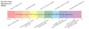
An index is a measure created from two or more other measures. The Employment Precarity Index is created by adding the weighted results from the following ten questions:
Question #1 Do you usually get paid if you miss a day’s work?
Question #2 I have one employer, whom I expect to be working for a year from now, who provides at least 30 hours of work a week, and who pays benefits.
Question #3 In the last 12 months, how much did your income vary from week to week?
Question #4 How likely will your total hours of paid employment be reduced in the next six months?
Question #5 In the last three months, how often did you work on an on-call basis?
Question #6 Do you know your work schedule at least one week in advance?
Question #7 In the last three months, what portion of your employment income was received in cash?
Question #8 What is the form of your employment relationship (short-term, casual, fixed-term contract, self-employed, permanent part-time, permanent full-time)?
Question #9 Do you receive any other employment benefits from your current employer(s), such as a drug plan, vision, dental, life insurance, pension, etc.?
Question #10 Would your current employment be negatively affected if you raised a health and safety concern or raised an employment-rights concern with your employer(s)?
Source: PEPSO (2015) The Precarity Penalty Executive Summary, pages 4-5.

Surveys usually rely on close-ended questions. Close-ended questions require the respondent to select from pre-defined answers such as YES or NO. These ten questions are no different. (The reader may also note that four of these questions are the questions used in constructing our first measure of employment precarity, described in blog post #3 ).
After these data are collected, responses to these ten questions are tallied for each survey. Each question is worth a specific number of points. The points from these ten questions are added together to create a single score ranging from 0 to 100. A low score indicates more secure employment whereas a higher score indicates less secure employment.
Next, each respondent’s scores are then compared to all the other respondents’ scores, and ranked from highest to lowest, that is, from the most precarious to the most secure. Of all the scores, the top 25% of the scores correspond to the ‘precarious’ category. This does not mean that the scores in the first quartile ranges from 76 to 100. Instead, it means that the survey respondents whose scoring on the Precarious Employment Index place them in the top quarter of all the surveys are defined as precariously employed. This process is then repeated three more times, each time placing another 25% of the population into a category.
This produces four employment categories — secure, stable, vulnerable and precarious — with the same number of people in each. These quartiles (so called because each contained 25% of the survey respondents) are useful in three ways. First, these identify the range of employment precarity and security in Niagara. This allows us to see what precarious and secure employment look like in Niagara, and the combinations these forms of employment take.
Second, when combined with future surveys in Niagara, the current findings will provide a benchmark to measure if Niagara’s employment is becoming more or less precarious. This would involve comparing the distribution of scores of new survey results with old survey results. If, overall, the precarity scores in a new survey tend to be lower than in the original survey, this implies that overall Niagara’s workforce is better off than before in that survey respondents report fewer of the conditions associated with employment precarity.
Finally, when calibrated with the scores used in PEPSO’s 2013 It’s More Than Poverty study, they provide a benchmark against which we can compare Niagara’s results with those in the GTA-Hamilton in 2011 (reported in the 2013 report) and 2014 (reported in PEPSO’s 2015 report).
Now that the reader has a sense of how we measure precarious employment using the Employment Precarity Index, their next question is likely this: What can this index tell us besides how many people are precariously employed? The short version is that this index allows us to then see if precarious employment tends to be associated with other good or bad outcomes. In our Nerd Blog #6, we will discuss the kinds of questions we asked to measure these good or bad outcomes. But before we do that, let’s look at some examples to show how the Employment Precarity Index is actually calculated in Nerd Blog #5.
